Colour Palette of the Week- Textural

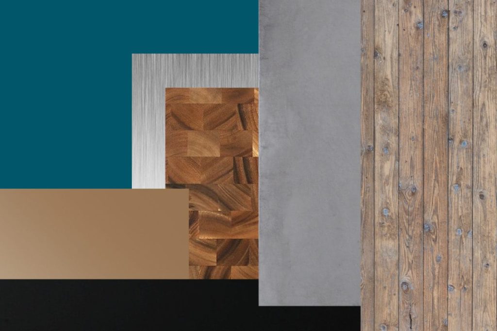
Textural colour palette

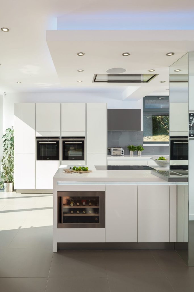
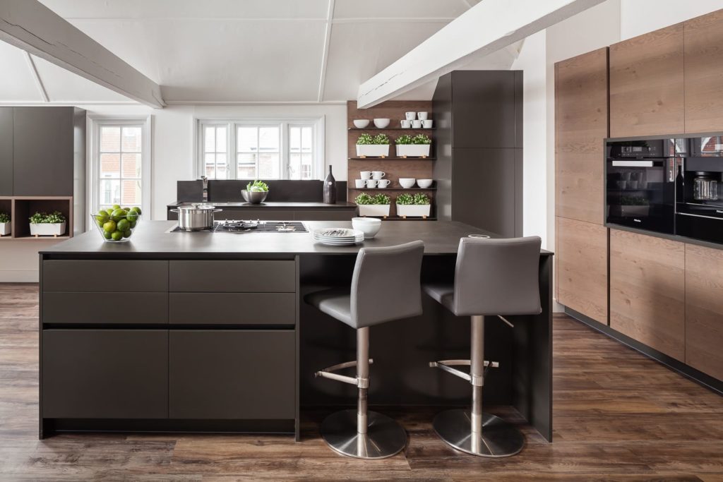
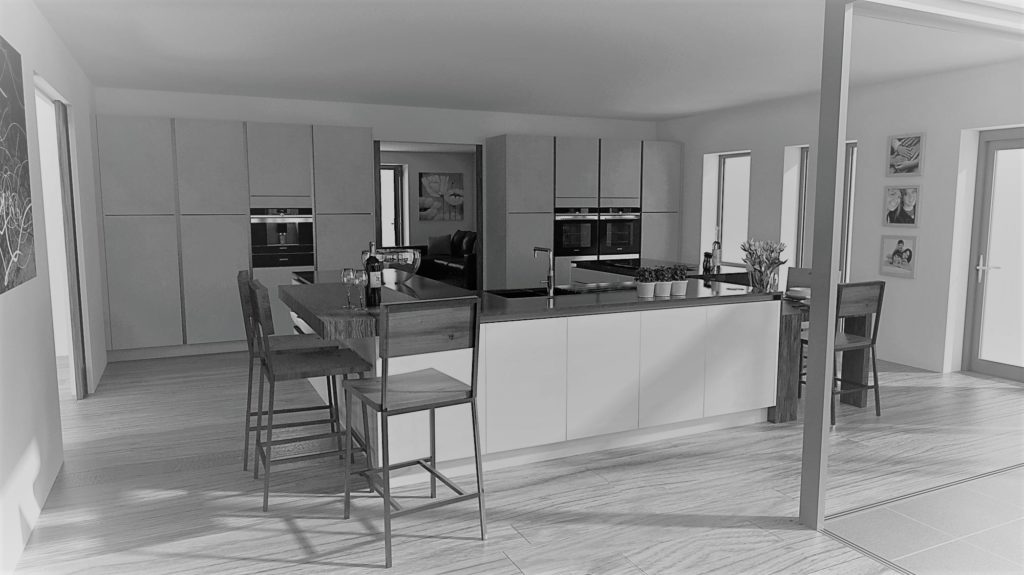
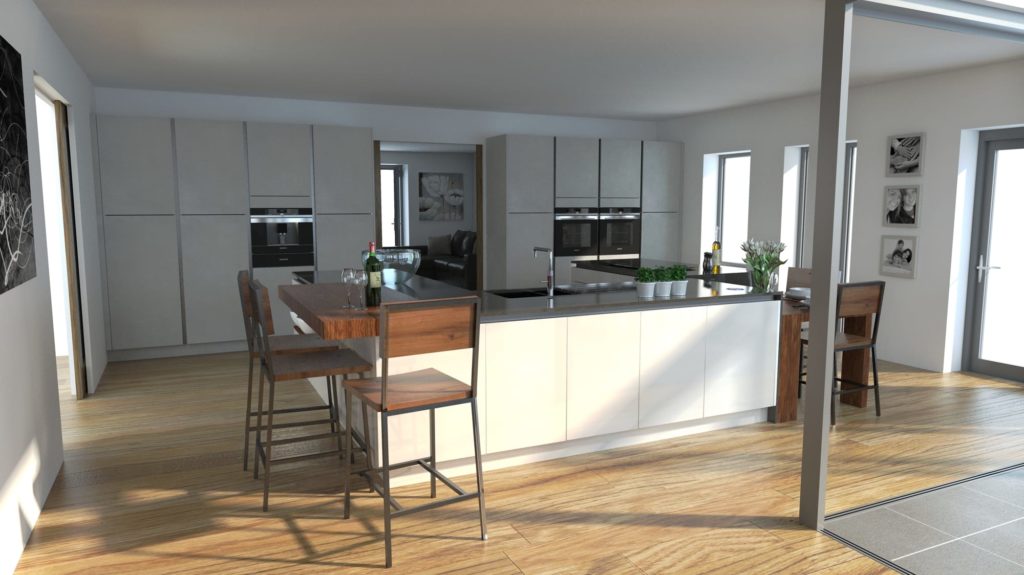
This ultra modern linear design which we recently created could fair looking quite stark without colour and texture to warm it all up.
2017 is the year of mixing materials!
Texture

Texture is gradually taking centre stage with increasing popularity of two-tone kitchen designs. Texture offers designers a versatile palette to mix and match with different shades to layer a design while seamlessly blending the kitchen, dining and living areas together.

Many designers like us at Jones Britain believe the use of textures is just as important as considering other elements such as colours, lighting, flooring, storage and extraction.

Texture is very important for the on-trend kitchens as it offers a less sterile look. However you can use the same idea on more traditional kitchens to give them a more modern look.
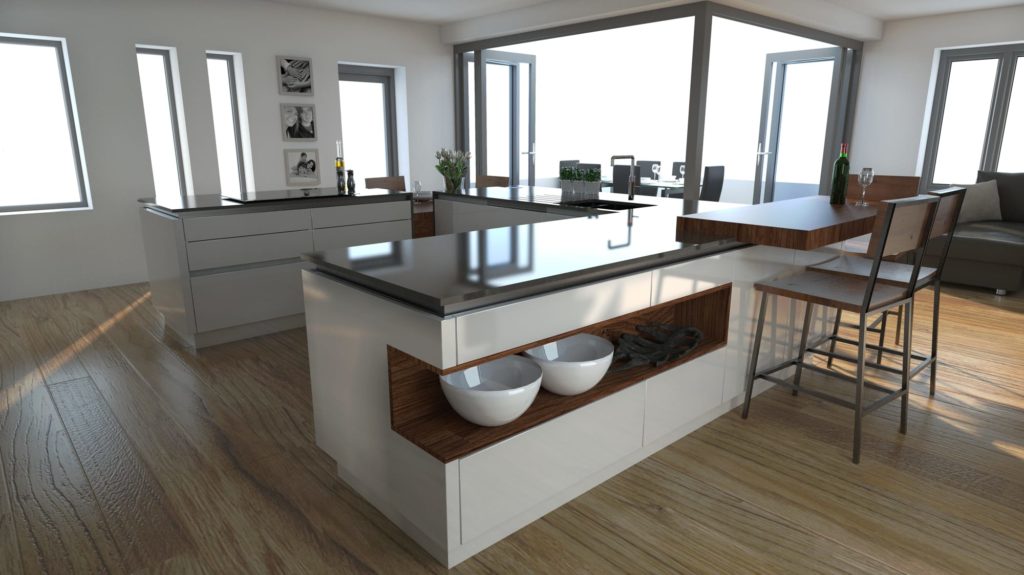
How can texture benefit a kitchen?

Textured furniture may be the latest look for a wide variety of kitchen interiors however it also offers advantages within the design.

Using textures can help to break up a large kitchen or define areas to make zones of visual impact/interest.

Colours and textures can be used to give an island impact and stand apart from the run of units behind it or to define an area such as having a dark colour along a run of tall appliance housing units.

Texture warms up a stark kitchen, with many clients choosing handless less fussy kitchen designs the area can start to become quite stark. Colour and texture offers a warm more authentic experience.

Your client may wish to use natural decors which helps bring the outside back into the room and lighten it all up.
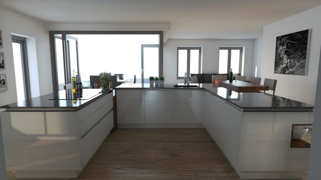
Jones Britain’s Most Recent Design

One of our most recent kitchen designs has had this issue- it is a beautiful modern new build with lots of windows, space and our client wanted a handless kitchen.

To warm up the design we made sure there was a range of colour and textures introduced.

Along the tall run of appliance housings we used a matt concrete effect door which contrasted enough against a pergamon gloss door to balance warm and cool.

We then decided to use a 30mm Quartz for the work surfaces. Most trends and kitchen designs we have completed recently involved a lot of lighter coloured work surfaces- this is not the case in this design.

To create more of an impact and keep the kitchen area feeling warm and inviting we have used Quartzforms Veined Baroque which is a dark grey quartz with lighter whisps of grey vein which appear in parts of the surface.

Creating elements of texture which help tie the design together was needed in the breakfast bar, low seating table area and the open bookshelf area. For this we have used a solid walnut work surface which again complements everything else we have chosen as well as warming the whole scheme up which in has given the overall design a real feel of home.

Blog Post written by: Chloe Hartnup, Junior Kitchen Designer at Jones Britain Kitchens

07.03.2017
Colour Palette of the Week- Scandi

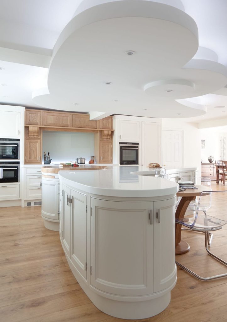
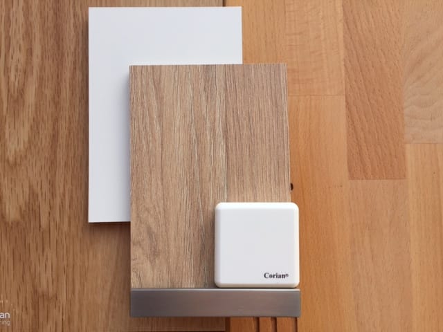
This scandi colour palette works tremendously well in this bespoke kitchen design, allowing the beautiful curved features in the kitchen to do all the talking. The Kitchen colour palette included Farrow & Ball Pointing on the units alongside a light natural oak which was used on the chopping block and mantel. Glacier White Corian worktops and a natural light oak flooring were also used within this scheme keeping it simplistic yet complementary against the design and shapes.

The use of a Scandinavian colour palette and traditional design has put a stylish and elegant twist on this bespoke kitchen design.

Our client came to Jones Britain having seen the advertisement of our KBB review awards finalists kitchen. They really liked our design ideas and wanted to use us for our skills in imaginative design.

Our brief was to design a kitchen that was large, spacious with plenty of working surface. The kitchen design had to be light bright and interesting with a major focal point at some point in the room. A slightly more traditional feeling was discussed – the buzz words were ‘Elegant’ ‘Stylish’ and ‘Functional’.

“We are absolutely delighted with our new kitchen. We occasionally send a photo to friends overseas and, without exception, they all say it is like something out of a glossy magazine.”

Why not pop into the Heathfield Showroom and let us help design your dream kitchen?

Blog Post written by: Chloe Hartnup, Junior Kitchen Designer at Jones Britain Kitchens

14.11.2016

Colour Palette of the Week- Earthy

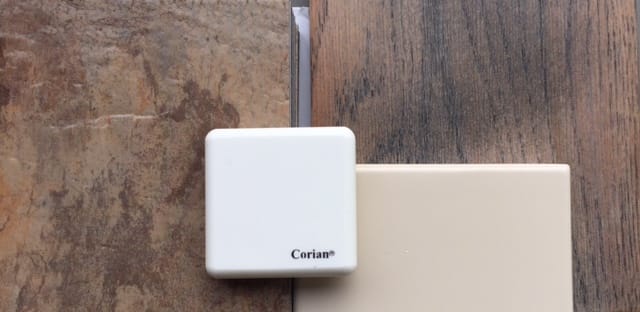
This earthy colour palette works in brilliant harmony with the beautiful views onto our clients garden bringing the outdoors in through colour and texture. The kitchen colour palette included pergamon base units on the wall run, veneered walnut tall and island units, a textural earthy coloured tile for the flooring and glacier white Corian worktops. The Corian worktops wrap around the spectacular curves in this very bespoke made kitchen.

We were asked to design a high end kitchen for a new build project in Esher that was not only different to your average kitchen but also innovative in its design.

This called for some pretty radical thinking outside the box.

This colour palette matched our Esher client’s kitchen brief perfectly.-  our clients love the curved kitchen island and the retractable TV integrated within the Corian worktop.

We were absolutely delighted to win 2nd Place in Charles Yorke’s ‘Best Design’ Awards 2013 for this kitchen.

Blog Post written by: Chloe Hartnup, Junior Kitchen Designer at Jones Britain Kitchens

19.11.2016

Colour Palette of the Week- Harmonious

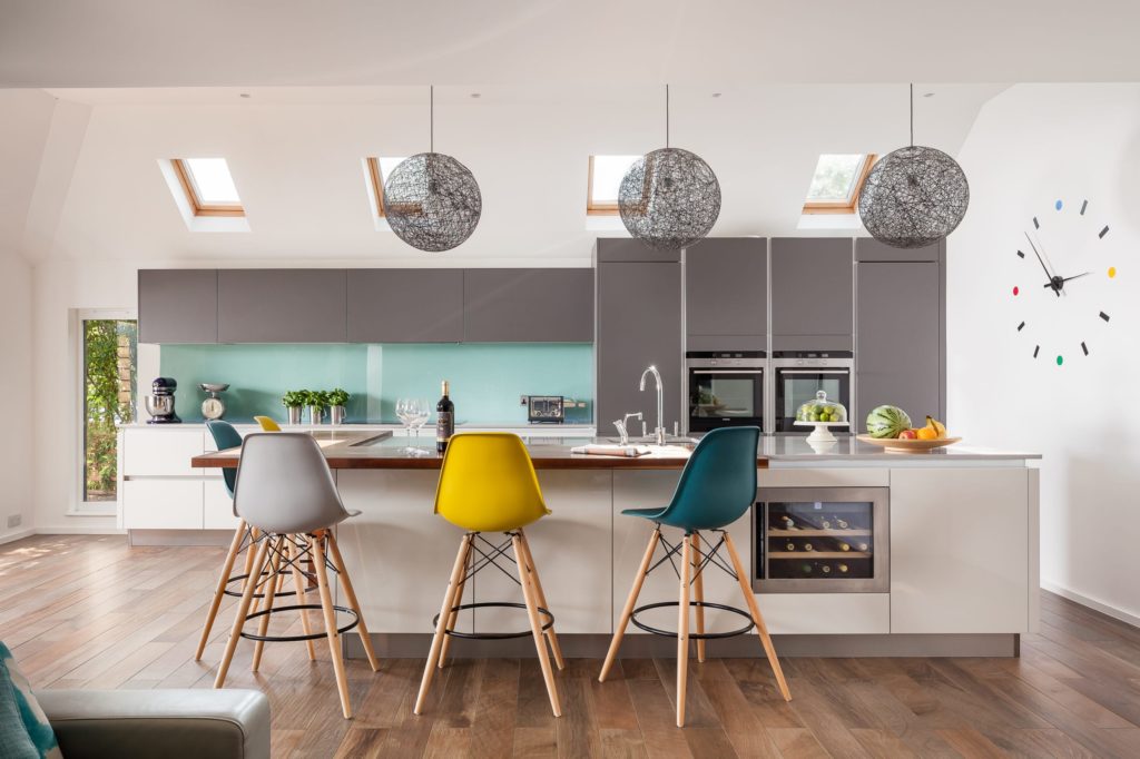
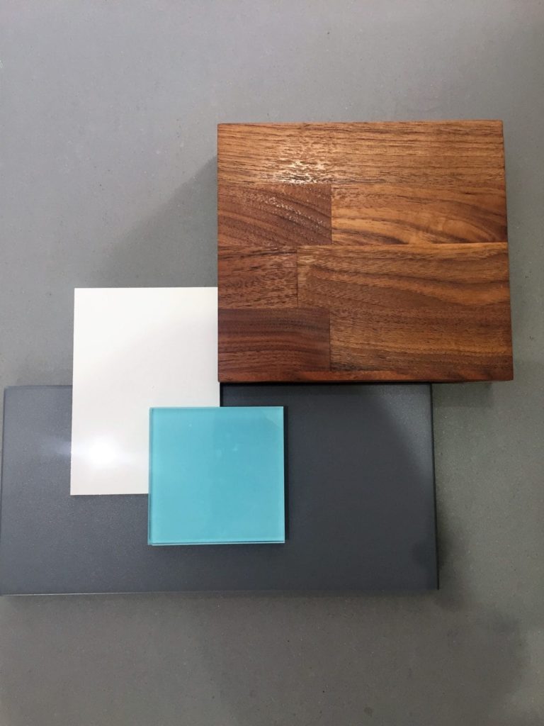
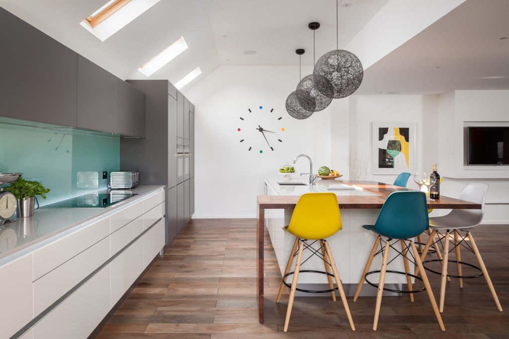
This harmonious, lighthearted and highly contemporary colour palette of pergamon gloss, matte graphite grey and accents of minty blue create a harmonious colour scheme which is very pleasing to the eye. The kitchen colour palette also has been united with Walnut to give warmth and substance to the kitchen design.

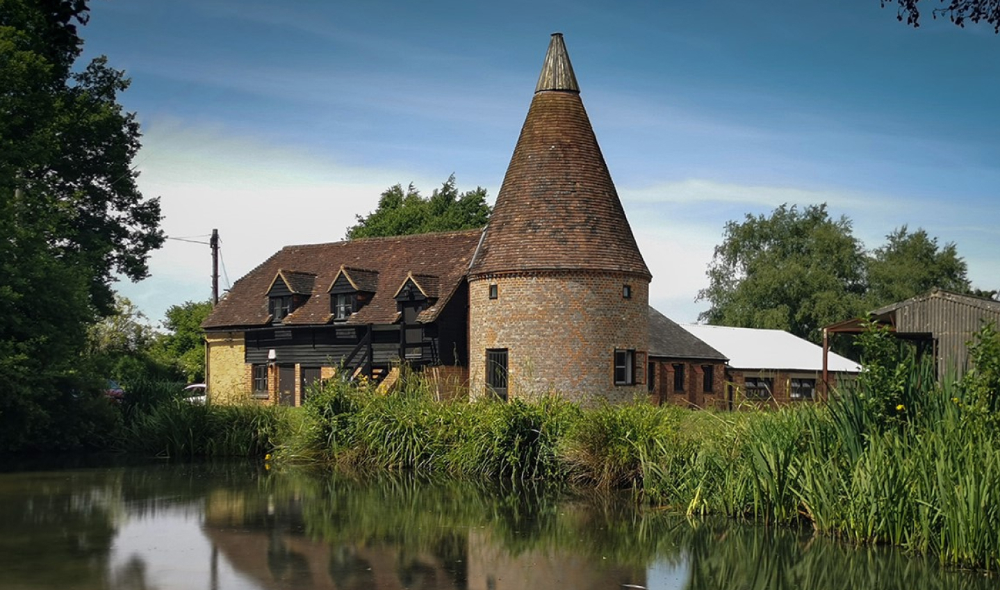
Our client wanted a highly contemporary, harmonious kitchen design for a traditional barn conversion. The brief was to give a wow-factor feeling with a minimalist design appeal.
In our design we chose a handleless kitchen with a mixture of pergamon high gloss lacquered doors and graphite grey matte silk accent for the tall and wall units. We integrated lights under the glass splashbacks, which give a superb effect at night. The Worktops we used are a mixture of quartz and walnut wood for the breakfast bar.

This colour palette matched our Broad Oak client’s kitchen brief perfectly.

Blog Post written by: Chloe Hartnup, Junior Kitchen Designer at Jones Britain Kitchens

20.11.2016

Colour Palette of the Week- Contemporary

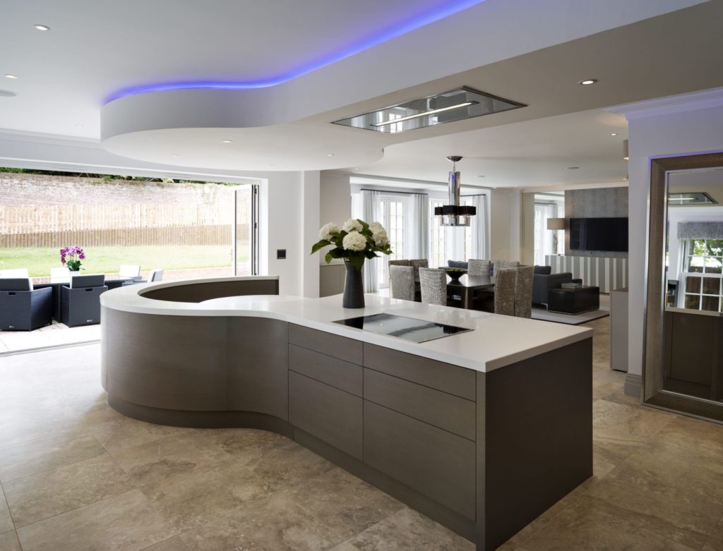
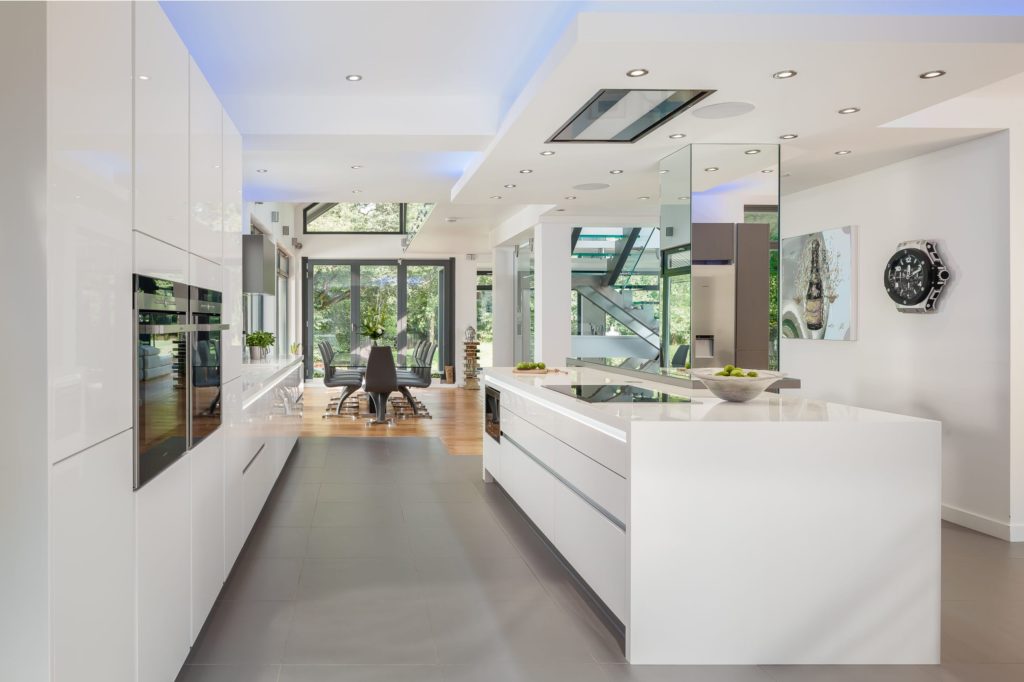
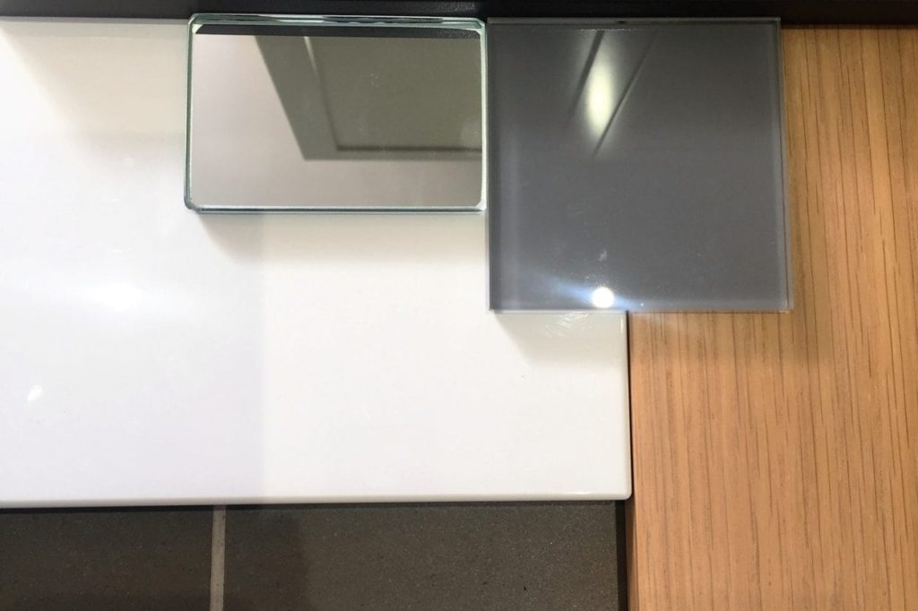
This ultra modern, crisp palette of white gloss and accents of graphite grey subtly marry together.

This contemporary kitchen colour palette also has been mixed with clear mirror, stainless steel, light oak and a glossy black (from the appliances).

You really can’t go wrong with this colour palette, it feels completely timeless and would work in the majority of kitchen spaces.

Corian worktops with a designer illuminated fin at one end of the island.  Graphite glass breakfast bar with a mirrored post and specially lit splash backs. The final elements of the design included a cleverly designed bulkhead for extraction, lights and surround sound speakers.

Our client wanted a ultra modern/contemporary kitchen design for their stunning new build. The brief was to give a wow-factor feeling with a minimalist design appeal.

Find out how we can help you with your kitchen colour palette..

Blog Post written by: Chloe Hartnup, Junior Kitchen Designer at Jones Britain Kitchens

30.11.2016

Siemens Wine & Dine at Aveqia

On Tuesday two of our Bespoke Kitchen Designers Dan Stronge & Chloe Hartnup were invited to the Siemens wine and dine evening which was being held at Aveqia, London. They were lucky enough to be wined and dined by Michlen Star Chefs Eric Allouard, Roger Rahaman & David Collard. Eric has over 20 years of cooking experience, having worked at a string of Michelin- and top class restaurants around the world, such as la tour D’argent, Fleur Sketch and L’Etranger.

Siemens at Aveqia

Siemens have recently fitted ovens, hobs and extractors into Aveqia for use throughout the commercial kitchen. The Michlen Star Chefs and our Siemens representatives went through each of the appliances explaining what they are and how we can use them. Dan & Chloe found this training very useful as it has broadened their knowledge of the products therefore creating new and exciting design ideas ready for any new customers coming into our Bespoke Kitchen Showroom in Heathfield.

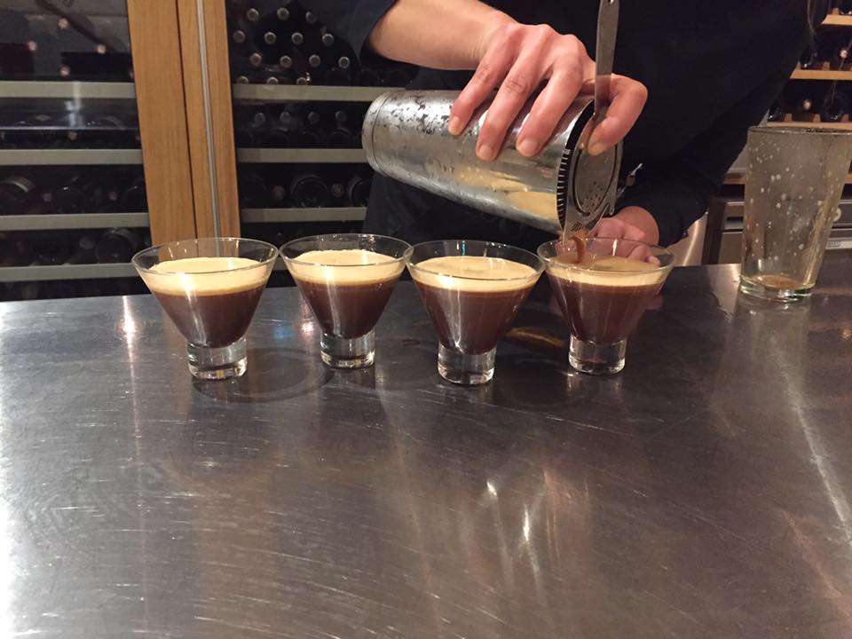
They were then sat down and the Michlen Star Chefs got to work in the kitchen. With the use of the Siemens appliances they were able to create some beautiful and delicious dishes for Dan and Chloe to try. Each course was paired up with a complementary wine showing us what can be achieved with beautiful food and wine flavours.

The Menu:

*Teriyaki glazed quail with pan fried foie gras and glazed apples
For the starter, guests will infuse quail with a sticky sweet teriyaki glaze and pair with pan fried foile gras. We add glazed apples and gingerbread for a spicy depth. The preparation of this dish will give your group a great opportunity to explore flavour combinations and techniques.

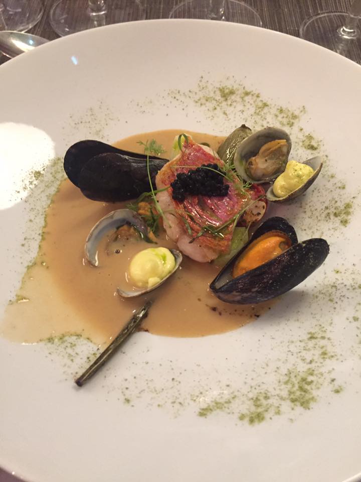
*Red mullet bouillabaisse, clams and mussels, smoked aioli
The second course celebrated Christmas in a Mediterranean style through the inspiration of a sun drenched beach. Plump fillets of red mullet are combined with an intense bouillabaisse, clams, mussels enhance the taste of the sea and smoked aioli completes the dish.

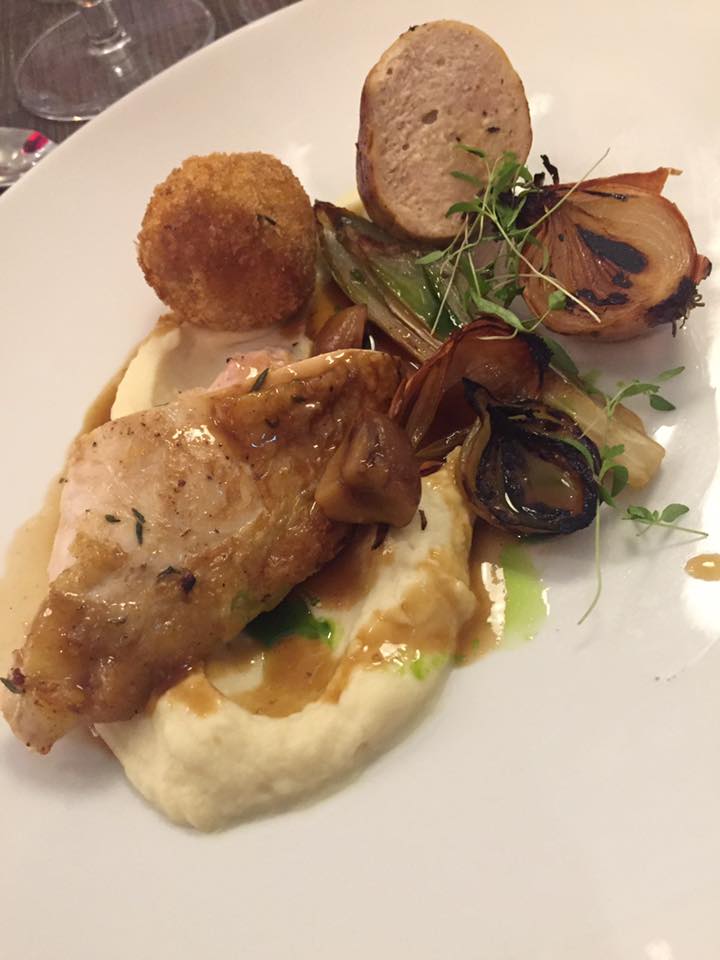
*Guinea fowl breast and sausage, truffle potato croquette and smoked celeriac puree
With the main course, you will learn to prepare succulent Guinea fowl breast and make rich sausages from the thighs. Trufled potato croquette and smoked celeriac puree bring the warmth of a glowing Christmas Day fire and a piquant savoury touch is added through a pickle onion and sage jus.

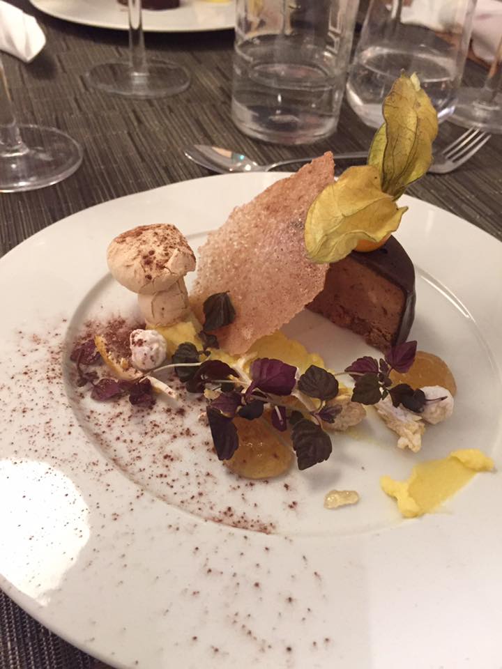
*Valrhone and praline parfait, bitter orange curd and Grand Marinier gel
For the finale of this Christmas menu, luxurious Valrhona chocolate and praline are combined to create a silky parfait. A subtle coffee meringue is complemented with a bitter orange curd and punchy Grand Marnier gel. All in all; a culinary gift which is a delight to unwrap…and consume!

For more information on Siemens appliances or appliance experience days feel free to contact the Kitchen Design Showroom on 01892 337575.

Blog Post written by: Chloe Hartnup, Junior Kitchen Designer at Jones Britain Kitchens

16.11.2016

Kudos Magazine November 2016

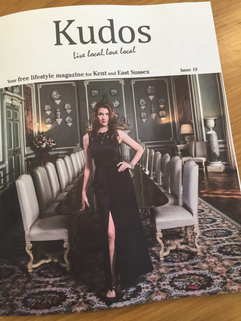
This month designs by Jones Britain Kitchens feature in Kudos Magazine (Issue 19) which is out now. Kudos is a free lifestyle magazine for Kent and East Sussex.

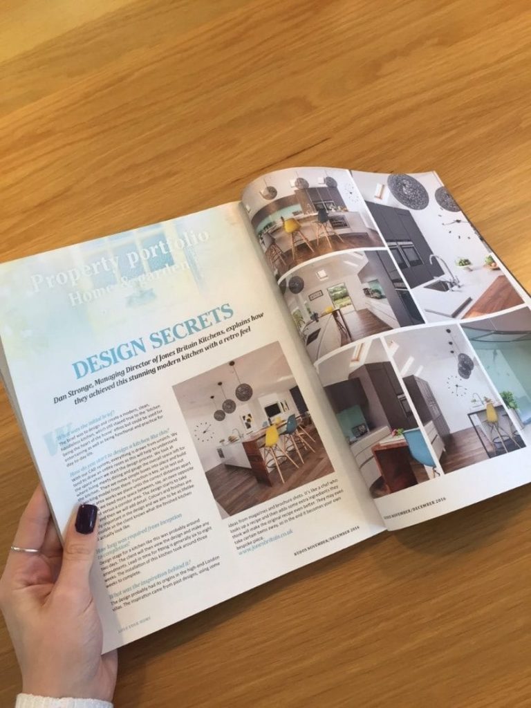
In this month we feature on pages 74 & 75 where Director & Head Kitchen Designer Dan Stronge explains how they achieved this stunning modern kitchen with a retro feel. Our customers were delighted with this kitchen design which brought a light yet playful living space to entertain friends and family.

Here’s a snippet of the article:
What was the initial design brief?

“The brief was to design and create a modern, clean handless kitchen, which still stayed true to the ‘kitchen being the heart of the home’ ethos but could be used for entertaining as well as being functional and practical for day-to-day life.”

Blog Post written by: Chloe Hartnup, Junior Kitchen Designer at Jones Britain

02.11.2016

Designer KB awards 2016

Exclusive Invitation

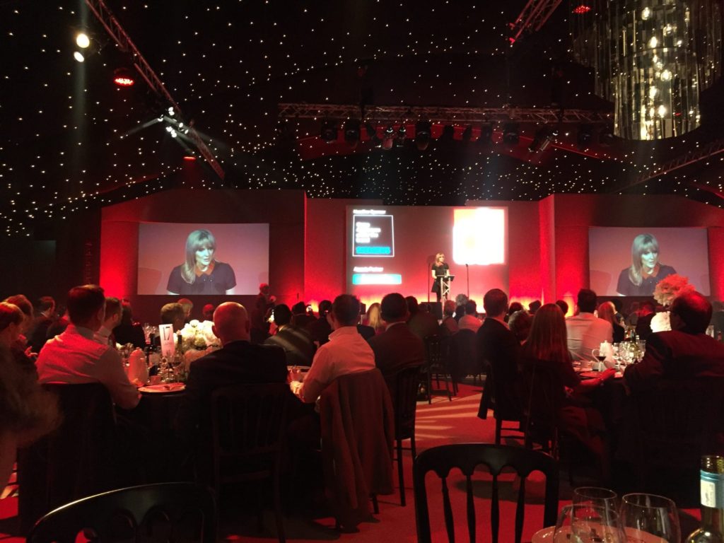
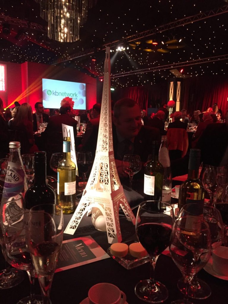
Managing Director and Head Kitchen Designer of Jones Britain, Dan Stronge has been out of our Heathfield Showroom today and up in London at the Supernova embankment gardens for the Designer KB Awards 2016 (Kitchen Bathroom Awards). The Designer KB Awards is an annual award ceremony recognizing talented UK Designers in the Kitchen and Bathroom sectors of the design industry.

The Venue

The Supernova is the highest quality temporary structure availing 2,500sqm of designed event space with state-of-the-art sound and lighting to be the perfect venue to host the elaborate and significant Designer Awards event. Passion, attention to detail and creative flair ensure the Supernova’s theatrical setting has the atmosphere to surpass all others.

The Judges

This year’s panel of judges include Founder & Architect of Crawford Partnership Alan Crawford and KB network Editor Grahame Morrison.

Dan was privileged to have been invited to the awards ceremony by Du Pont as their guest of honour and found the event a brilliant evening for networking with other Kitchen designers. Among the design nominees were some fantastic bespoke kitchen designs. These have inspired Dan to enter the competition next year with one of his bespoke, handmade and innovative kitchen designs.

Congratulations and thank you to all of those that took part and made the event so memorable and inspirational. Bring on KB Awards 2017!

Dan Stronge

Blog post written by: Chloe Hartnup, Junior Kitchen Designer at Jones Britain

09.11.2016

Richlite Paper Worktops

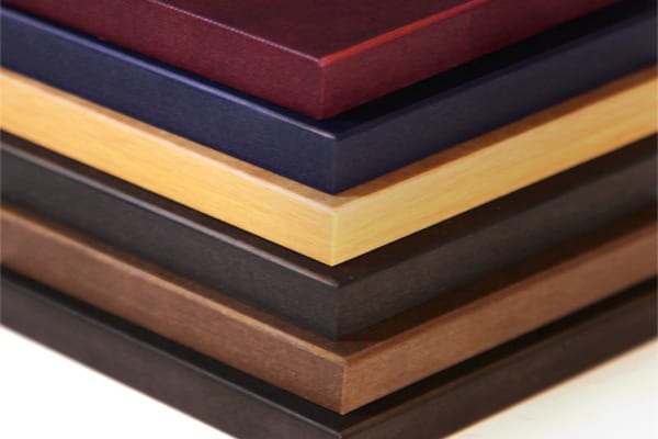
Richlite is a durable, versatile, and sustainable material made from resin-infused paper.

Originally developed over 70 years ago Richlite has expanded into a premium surface material used in many different areas. Handmade from many layers of high quality custom craft paper, Richlite’s surface texture comes from the natural variation in the way fibers lay within the paper. Composed of approximately 65% FSC®-certified or recycled paper content and 35% phenolic resin, Richlite’s color comes from a combination of the paper and the amber tone of the resin.

With many inherent advantages, Richlite continues to be utilized for its versatile range of features and benefits. Unlike stone or a solid surface, Richlite works similar to a dense hardwood and can be easily milled, sanded, routed, and joined. Richlite is water-resistant, sanitary, has low moisture absorption, heat and fire resistant, extraordinarily dense and durable, and has a natural appeal due to its paper construction.

HOW IT’S MADE

Made from many layers of high quality decorative paper, Richlite’s surface texture comes from the natural variation in the way fibres lay within the paper. These rolls of paper are saturated with a thermosetting resin before they are cut to length and laid up by hand. Each sheet is carefully stacked, alternating the direction of paper for the ultimate balance and stability. The stacks are pressed under even heat and pressure, which bonds the layers of paper together and cures the resin. The panels are then slowly cooled to produce a solid, stable sheet material.

Richlite’s colour comes from a combination of the colour of the paper and the deep amber tone of the resin. No dyes are added to the material, and all of the paper is either post consumer waste recycled or sustainably harvested FSC® Certified paper.

Unlike stone or solid surface, it works very similarly to an incredibly dense hardwood and can be milled, sanded, routed and joined. Richlite can be pressed to order from 3mm to 75mm in a range of sheet sizes up to 3660mm x 1525mm. It is shipped from the factory with a mill surface which can be used raw in some applications. Some applications need to be processed by a fabricator to create a leathered or honed surface for the best performance.

History

Founded in 1943 in the Pacific Northwest, Richlite was originally used for machine tooling by the aerospace industry. Eventually the paper-composite material was adopted by the commercial food industry due to its sanitary and durable qualities. Richlite was embraced by the marine industry due to its water-resistant construction, and the action sports industry for use in building skateparks. In the early 2000’s, the architecture and design community began to utilize Richlite for numerous interior and exterior applications. Today Richlite is widely used in consumer products and still in use as an industrial material.

We have Richlite on display in the Jones Britain showroom. It have to be the most tactile surface we have on display and the great thing about it is that its both really strong and extremely versatile which means that we can use it for almost any application in our bespoke kitchen designs.

Source of content from Richlite.com & surfacematter.co.uk

Blog Post written by: Dan Stronge, Head Kitchen Designer at Jones Britain Kitchens

26.09.2016

Colour Palette of the Week- Industrial

Colour palette of the week

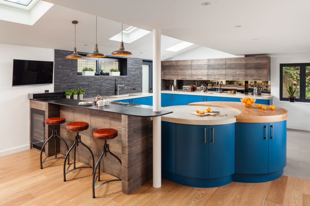
This industrial palette of blue, copper/bronze and wood go really well together. Blue has been the no.1 kitchen design colour of 2016 and is in the frame for being the colour of 2017 too.

The blue used here is RAL 5009 Azure Blue. Mixed with bronze mirror, poured and troweled concrete, end grain oak butchers block, Richlite Black Diamond, stainless steel and scaffold floor planks.

This palette was used to great effect when designing our bespoke handmade kitchen from Crowborough.

Blog Post written by: Dan Stronge, Head Kitchen Designer at Jones Britain Kitchens

01.08.2016

Start your kitchen dream with us now

  • Contact details
  • The Workshop
  • Hendal Farm
  • Cherry Gardens Hill
  • Groombridge
  • East Sussex TN3 9NU
  • 01892 337575
  • [email protected]
  • Opening hours
  • MON: 9.00am - 5.00pm
  • TUE: 9.00am - 5.00pm
  • WED: 9.00am - 5.00pm
  • THU: 9.00am - 5.00pm
  • FRI: 9.00am - 5.00pm
  • SAT: APPOINTMENT ONLY
  • SUN: CLOSED