Textural colour palette
This ultra modern linear design which we recently created could fair looking quite stark without colour and texture to warm it all up.
2017 is the year of mixing materials!
Texture
Texture is gradually taking centre stage with increasing popularity of two-tone kitchen designs. Texture offers designers a versatile palette to mix and match with different shades to layer a design while seamlessly blending the kitchen, dining and living areas together.
Many designers like us at Jones Britain believe the use of textures is just as important as considering other elements such as colours, lighting, flooring, storage and extraction.
Texture is very important for the on-trend kitchens as it offers a less sterile look. However you can use the same idea on more traditional kitchens to give them a more modern look.
How can texture benefit a kitchen?
Textured furniture may be the latest look for a wide variety of kitchen interiors however it also offers advantages within the design.
Using textures can help to break up a large kitchen or define areas to make zones of visual impact/interest.
Colours and textures can be used to give an island impact and stand apart from the run of units behind it or to define an area such as having a dark colour along a run of tall appliance housing units.
Texture warms up a stark kitchen, with many clients choosing handless less fussy kitchen designs the area can start to become quite stark. Colour and texture offers a warm more authentic experience.
Your client may wish to use natural decors which helps bring the outside back into the room and lighten it all up.
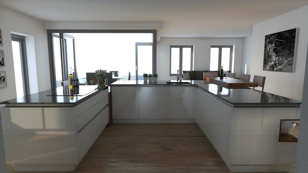
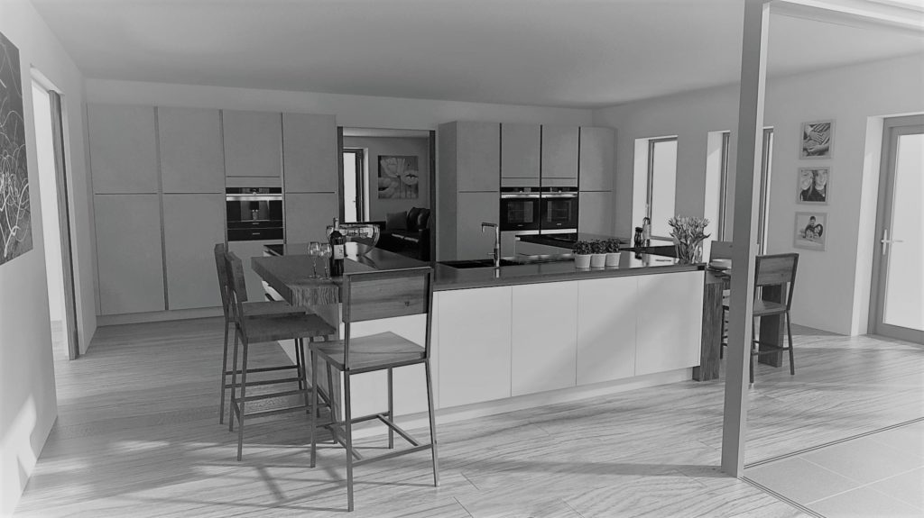
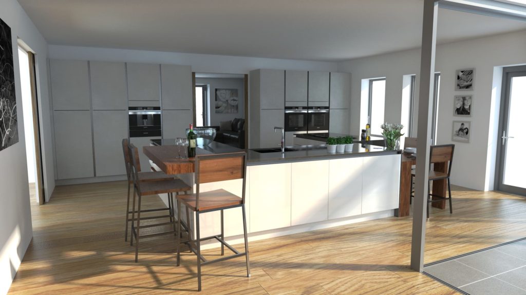
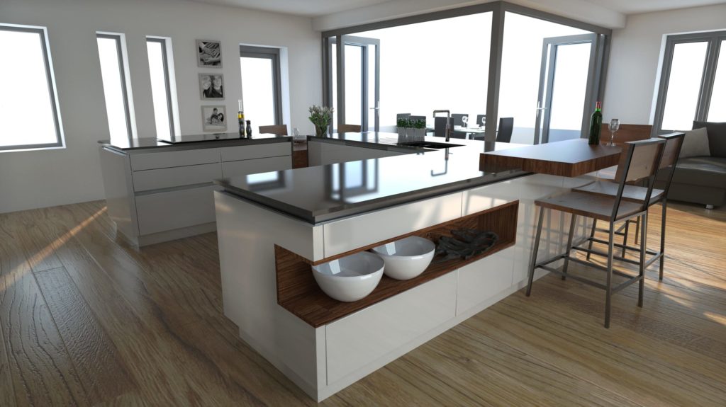
Jones Britain’s Most Recent Design
One of our most recent kitchen designs has had this issue- it is a beautiful modern new build with lots of windows, space and our client wanted a handless kitchen.
To warm up the design we made sure there was a range of colour and textures introduced.
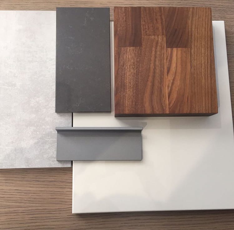
Along the tall run of appliance housings we used a matt concrete effect door which contrasted enough against a pergamon gloss door to balance warm and cool.
We then decided to use a 30mm Quartz for the work surfaces. Most trends and kitchen designs we have completed recently involved a lot of lighter coloured work surfaces- this is not the case in this design.
To create more of an impact and keep the kitchen area feeling warm and inviting we have used Quartzforms Veined Baroque which is a dark grey quartz with lighter whisps of grey vein which appear in parts of the surface.
Creating elements of texture which help tie the design together was needed in the breakfast bar, low seating table area and the open bookshelf area. For this we have used a solid walnut work surface which again complements everything else we have chosen as well as warming the whole scheme up which in has given the overall design a real feel of home.
Blog Post written by: Chloe Hartnup, Junior Kitchen Designer at Jones Britain Kitchens
07.03.2017